jazzdor festival microsite
Art direction, microsite, and UI animation for the Jazzdor Festival, a semi-annual European jazz festival. Our final product complemented the nuances of jazz through an explorative audio-based experience that music enthusiasts would visit after the live festival ended.
This is a case study purely for research purposes!
roles
ui design
ui animation
art direction
software
figma
after effects
team
Jaden Lee
Emily Xu
Daphne Borrel
Megan Yung
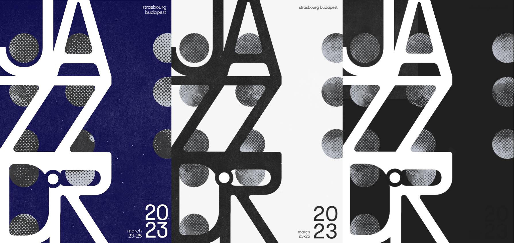
the poster
3 out of the 5 weeks of our project were spent developing a final poster to stand as the chassis to our microsite (which is a story for another day). Our goal was to drive geometry placement through typography, which we achieved by leveraging the flare of our display typeface PP Rader.
I chose GT Walsheim for supporting copy, since the punchy dots over the j in 'jazz' would be used a lot.
the content
Through some digging, my teammates discovered three heavily-curated playlists from Jazzdor's 2022/2023 festival on their official Soundcloud that barely had any listens. Each playlist was representative of a different emotional tone of jazz.
We chose to build the microsite around these playlists, providing three pages of jazz discovery. Inside, we brought forward subtle meanings and relationships between instruments for each song.
microsite tests
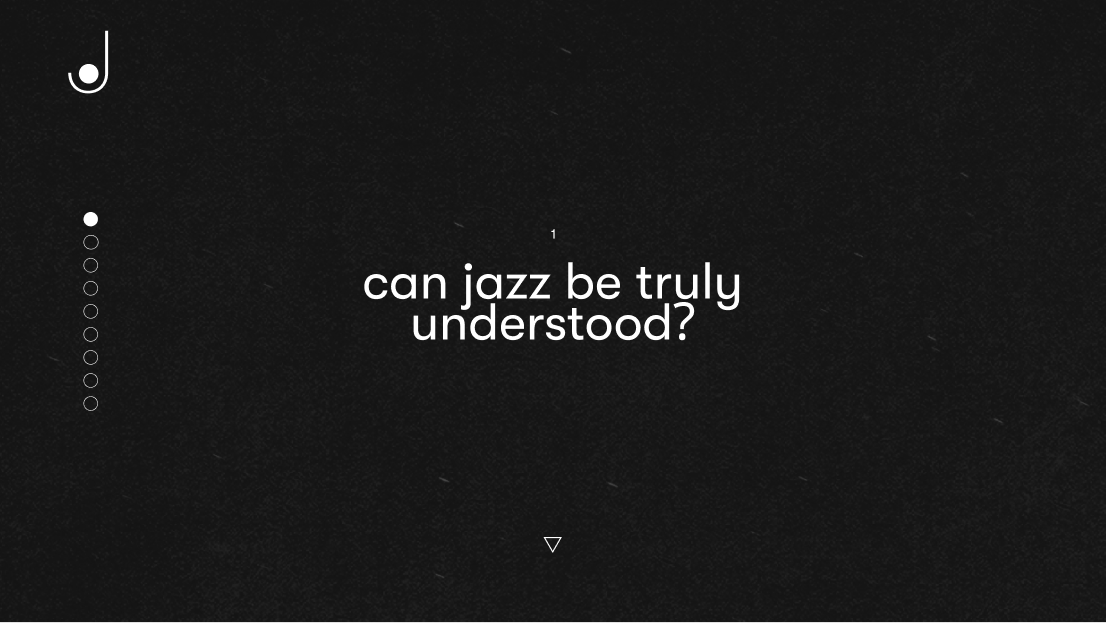
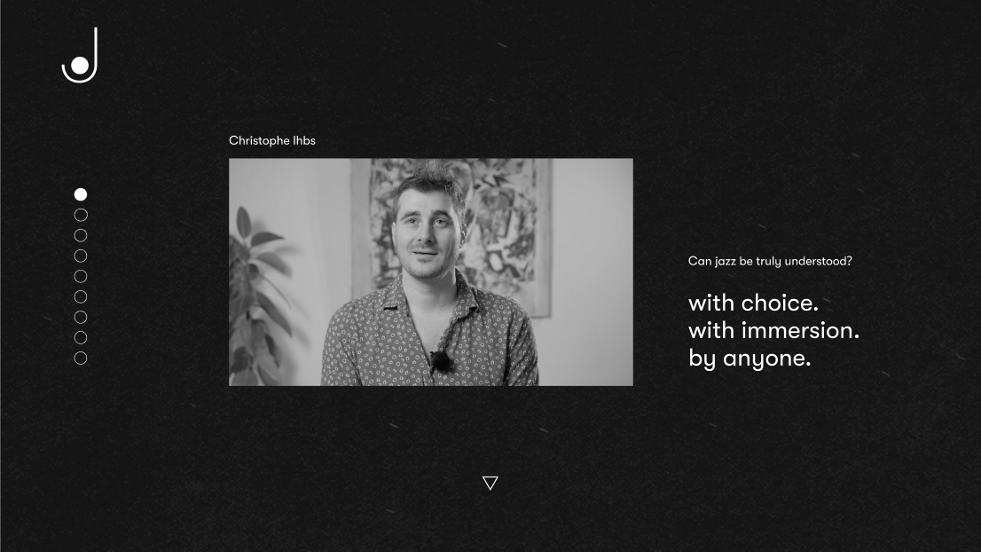
Before settling on our final microsite idea, each of us spent some time testing. I fully developed the interaction and motion for one idea, a narrative-driven experience focused on the exploration of jazz through community interviews.
This ended up being a proof-of-concept for one of our most used interactions: hiding images under texture, then revealing them on hover, which I got to animate for the final UI later.
the microsite, 1 - landing page
Our landing page features the emotions and shape languages that we derived from the three playlists. We repurpose the shapes from this page as our navigation in the home page.
2 - home page
Our cursor expands to fit inside geometry and locks to indicate interactivity. Once they select a song, the user is taken into the song page. The transition between pages repurposes the playlist menu into the new song menu.
3 - song page
Throughout the song page, I animated and designed the micro-interactions between the cursor and surrounding objects. The song page features analyses of the selected song.
When hovering over images, the cursor molds to its shape and strips back the texture to reveal the photograph. To indicate the user's control, the annotation and image shift with the cursor until it's pulled away.
4 - artist page
Site visitors can view content about artists that focuses on information that can be heard or revealed through their music.
finale
For the sake of finishing the project on time, we could only flesh out one of the three playlist directions (la playlist bleue). I feel like it would be fun to go back and do some tests for 'la playlist rouge' and 'la playlist verte' as well to see what would change and what could be different!
Speaking from 2024, this project is nearly 2 years old by now. If I redid it tomorrow, I think I'd try to explore motion other than fading and sliding, but it was good at the time to practice my graph editor skills :)